Problem with mobile (3-bars) navi menu

Hi,

I noticed that when the browser window is scaled to smaller width and the navigation bar text-links change to the mobile navigation menu icon - If hovering on the 3-bar navigation menu all 3 page links are now suddenly hovering on top of the content, and not under the 3-bar navigation menu icon… how is this happening? (see pic)

URL: www.bigart.cc

Thank you

Also when accessing the website on mobile, the same problem appears and basically renders the whole menu useless, and as such the whole site un-usable on mobile.

Regards,

Teppo

Hi Teppo

Im sorry but the mobile menu does not working for me at all, does it work for you?
there is a bug report on this problem

Hello, is there any update on if/how/when this could be fixed?

Now that we have added a filter function to our gallery page, this problem is even more problematic on the mobile. See attached pic.

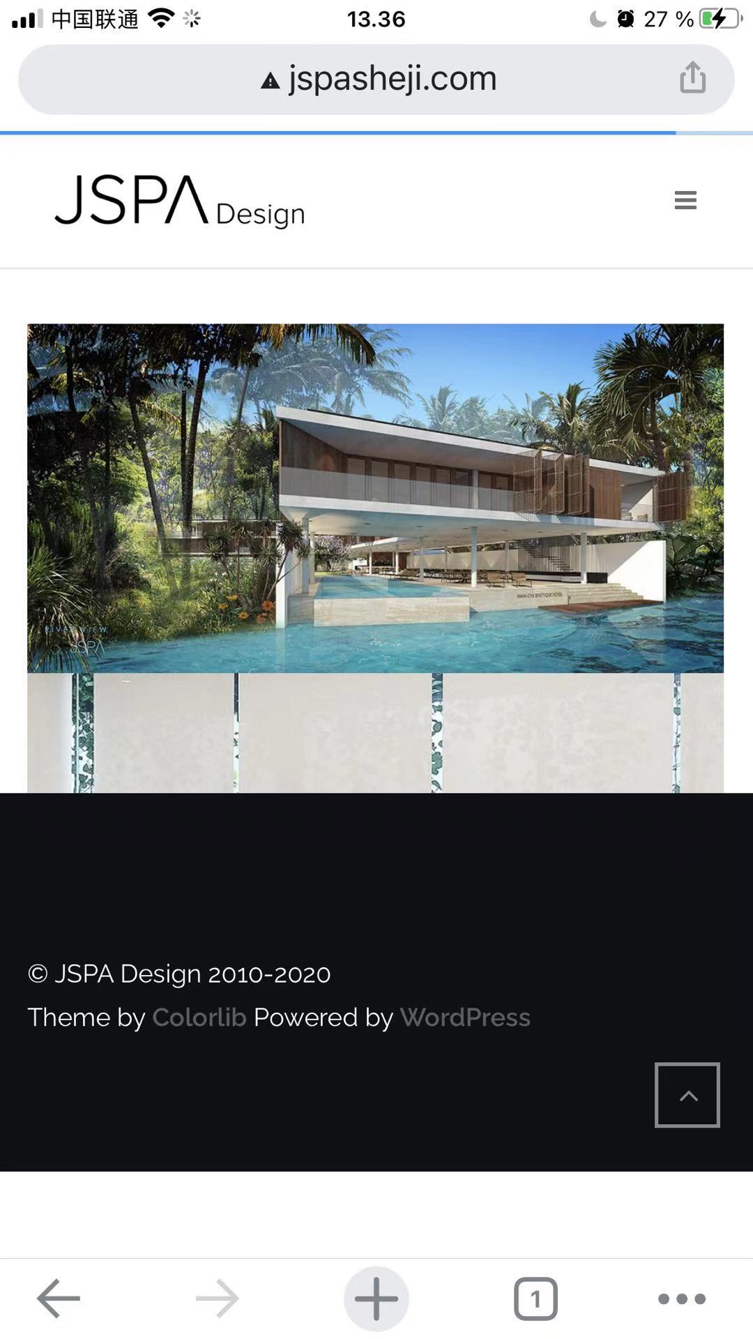
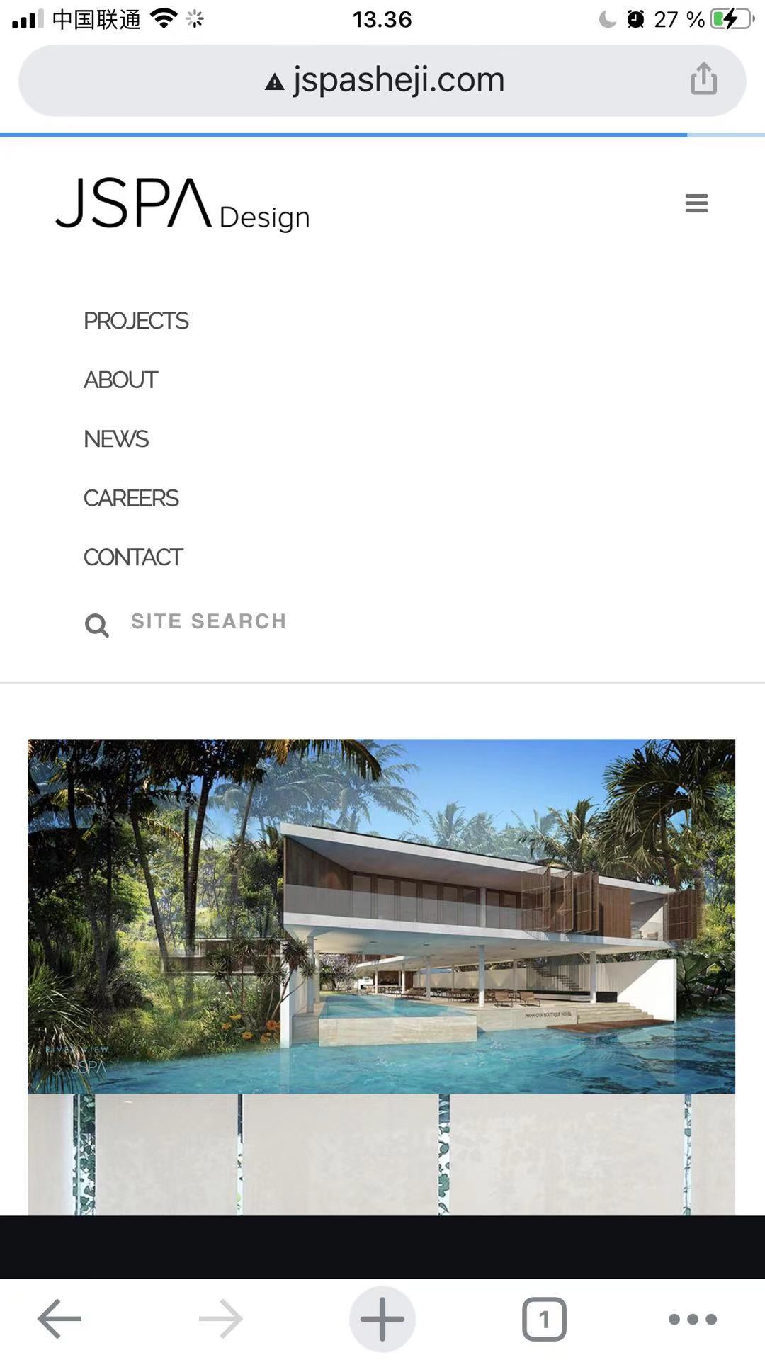
Oddly, on one of our other websites www.jspasheji.com the mobile navi menu works fine - open and closing it just pushes the rest of the content down… Like we would like it to work with www.bigart.cc as well. (see pics 2 & 3)

We’ve used the same theme and basically all same formatting/settings on both sites… but don’t understand why it works in one, but not the other.

Hi

Menu on your site can be fixed by this code:

@media (max-width: 991px){
.nav-bar .module-group {
z-index: 999;
background: #fff;
}
}

Filter for portfolio, its not theme related, your portfolio filter is added by a third party plugin